How to Style Botanical Prints in Your Home
Botanical art has long held a special place in interiors — offering a way to bring the serenity and vibrancy of the natural world into our daily lives. Whether bold and joyful, or soft and understated, floral art prints can transform a room with character and warmth. At Liz Govier Art Studio, each piece in The Botanical Collection is created as a conservation-quality digital painting, designed to enrich a space with beauty that endures.
In this journal entry, I’ll share simple yet elevated ways to style botanical prints in your home, using a selection from the collection as inspiration.
1. Let a Single Statement Piece Shine
Sometimes one artwork is all you need. A striking piece, such as the Sunflowers print, brings instant warmth and vibrancy into a room. Placing it above a sideboard or console table allows the bold yellows and rich greens to become the focal point, particularly when styled alongside simple objects in natural textures like wood, linen, or ceramic.

The Sunflowers print styled as a statement piece above a sideboard, bringing warmth and vibrancy into the room.
2. Pair Prints for Balance
Combining two artworks side by side creates harmony and rhythm within a space. For instance, pairing the Madame Alfred Carrière roses with the White Lilies produces a calm, elegant arrangement. Their complementary whites and greens provide a gentle contrast, while the natural wood frames keep the look cohesive.

Soft whites and greens — Madame Alfred Carrière roses and White Lilies make a calming, balanced pair.
3. Create a Gallery Wall
For a more layered approach, mix three or more botanical pieces in varied sizes. Gallery walls allow you to combine bold and delicate blooms to tell a story across the wall. Here, the soft whites of the Madame Alfred Carrière roses, the golden glow of the Sunflowers, and the rich tones of the Carnaby Iris work beautifully together, united by natural light and neutral surroundings.
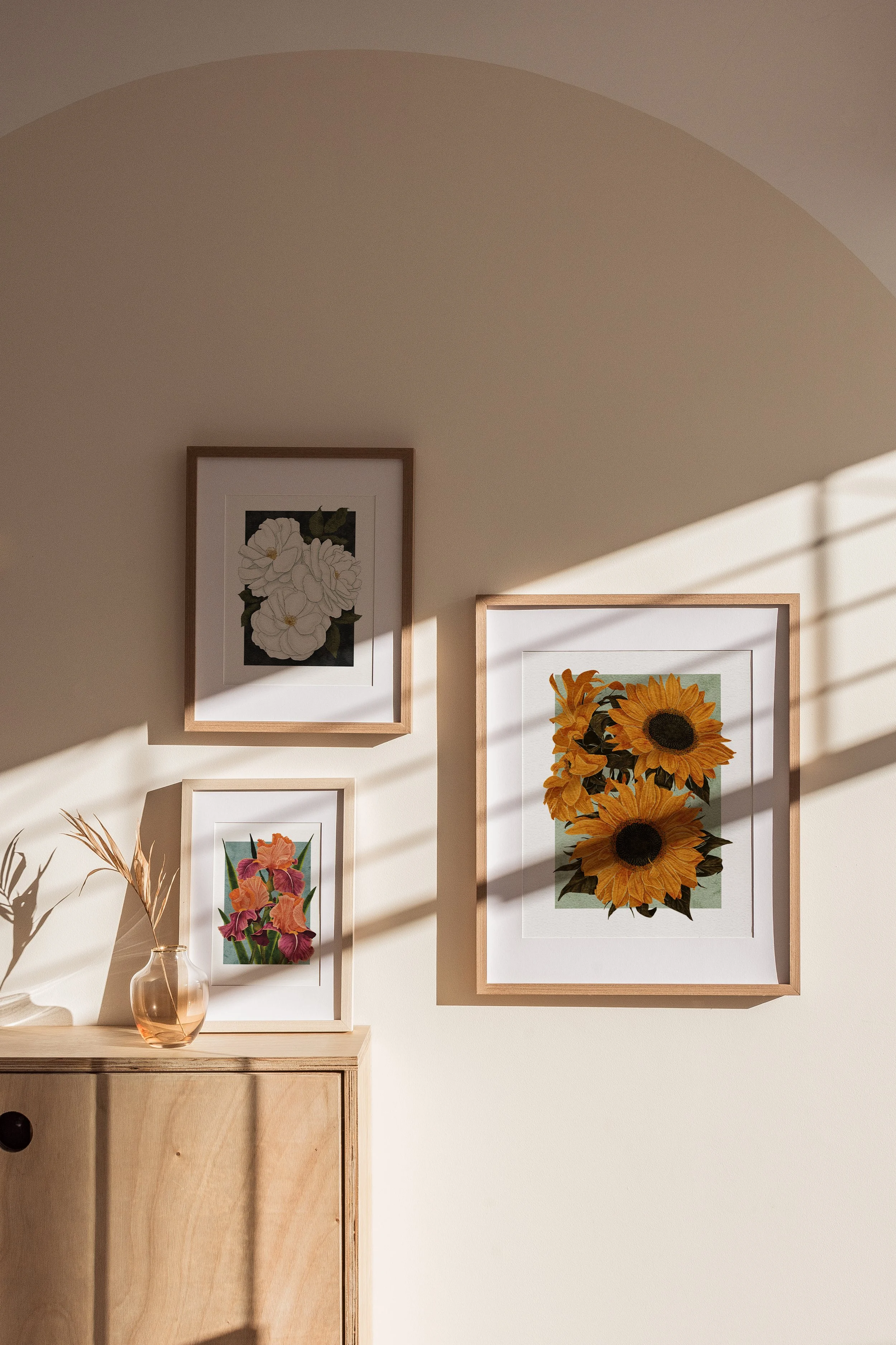
A gallery wall arrangement featuring Sunflowers, Madame Alfred Carrière, and Carnaby Iris for layered colour and texture.
4. Use Colour for Impact
The beauty of botanical prints lies in their diversity of colour. The Karl Rosenfield Peonies or Pink Roses make a striking impact against neutral walls, offering vibrant pinks that immediately draw the eye. Positioning these alongside more subtle prints, such as the Lupins, can help balance brightness with depth, creating a dynamic yet refined effect.
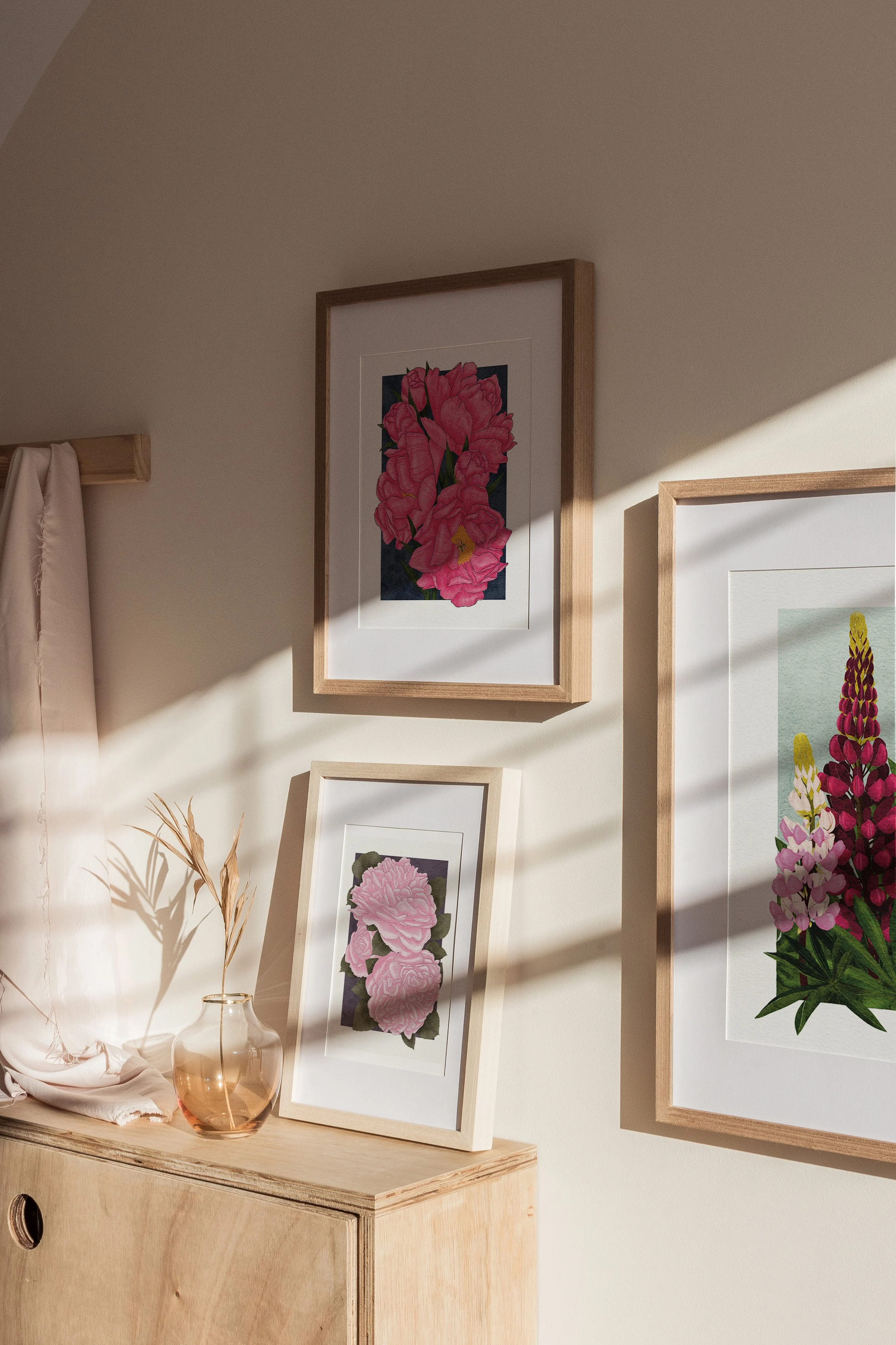
Vibrant pinks balanced by softer tones — Karl Rosenfield Peonies, Pink Roses, and Lupins styled together.
5. Style with Texture and Light
Natural light brings out the richness of archival inks, while surrounding textures — linen, rattan, or dried stems in simple vessels — enhance the organic character of the artwork. A piece like the Carnaby Iris paired with Lupins illustrates this beautifully, especially when placed on a wooden sideboard with minimal accessories.

Natural textures and light enhance the details of the Carnaby Iris and Lupins prints.
6. Quiet Corners and Calming Spaces
Not every artwork needs to be the centre of attention. Sometimes the most powerful styling comes in quiet corners — a single framed print above a reading table, styled with a book and a vase. The Madame Alfred Carrière roses, with their soft petals and deep green leaves, lend themselves perfectly to this more intimate mood.

A quiet corner styled with the Madame Alfred Carrière roses print, paired with simple objects for a serene mood.
Final Thoughts
Botanical prints offer endless styling possibilities, whether you’re drawn to bold colour or subtle detail. Each artwork in The Botanical Collection has been designed to sit beautifully within a range of interiors — from modern minimalism to traditional charm.
To browse the full collection and find the perfect piece for your home, visit The Botanical Collection.